Branding
Here you can find all the information and color codes to our logos and background we use.
INFO
All of the materials are avaliable in our GitHub repository.
Version 1.0
These are the materials for our version 1 release.
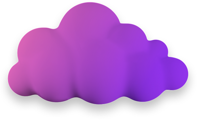
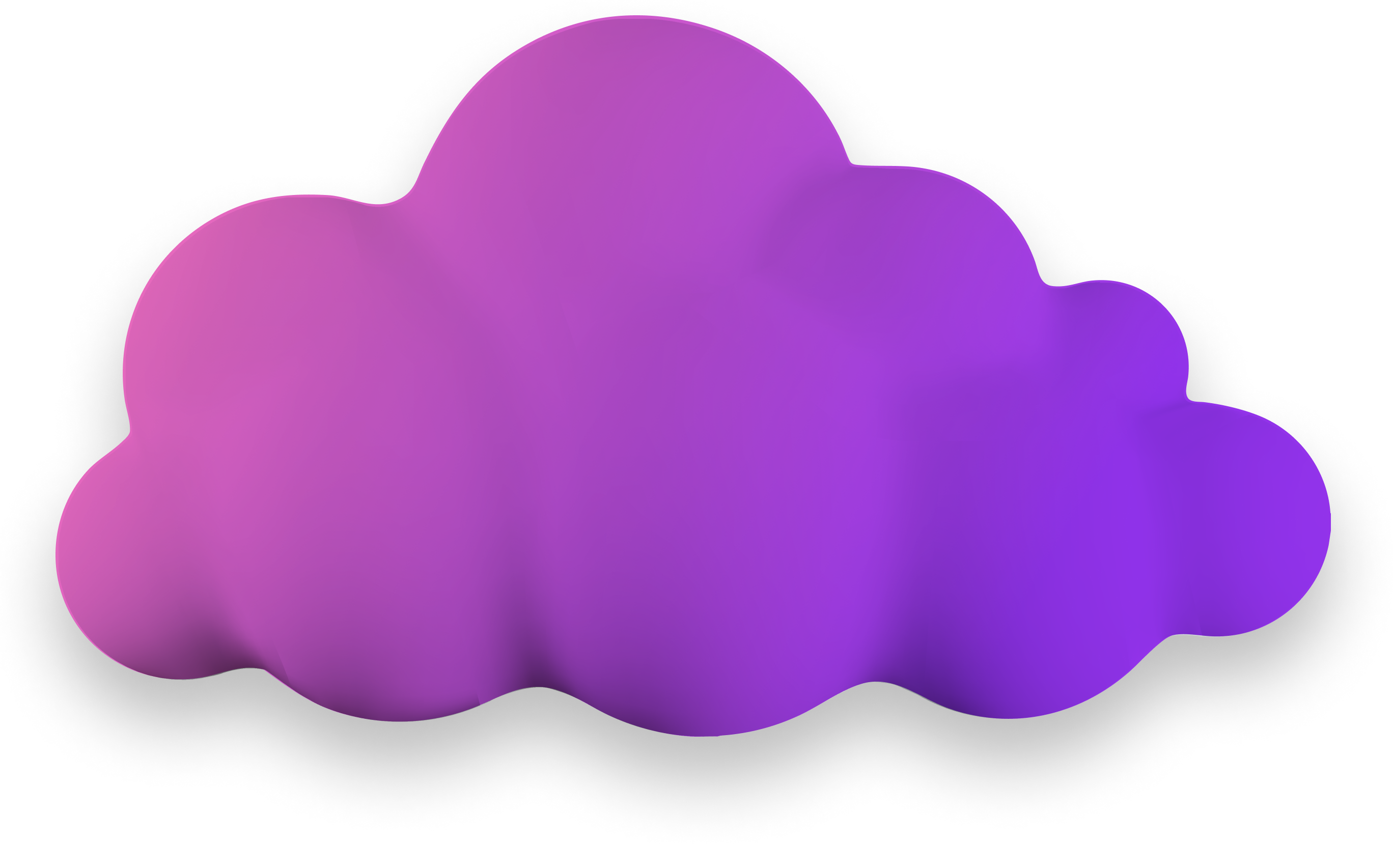
Logo
Our logo was made in Figma by an anonymous helper of ours. 😉
INFO
The raw .fig file may be avaliable in the future.
| Logo Cropped (full size, might wanna resize it, for more optimal loading speeds) |
|---|
 |
Settings
| Effect Type | Value | Note | Screenshot |
|---|---|---|---|
| Gradient | 36%: #9333EA -> 100%: #F472B6 | Angle: 120° | 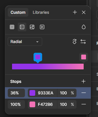 |
Old Design
WARNING
The settings and materials below are for the outdated "legacy" version!
Logo
The shape of the logo is based on the "cloud" icon provided by Google Material Icons.
INFO
The raw .PSD file can be found on the repository.
| Logo Cropped | Logo with Background |
|---|---|
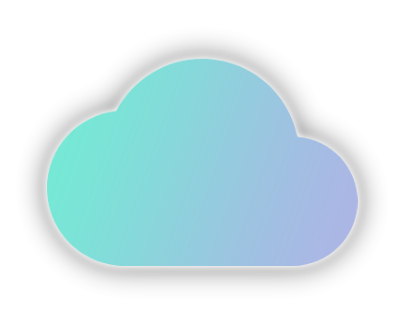 | 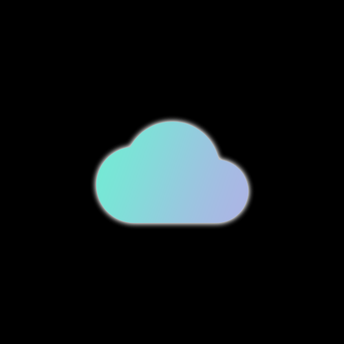 |
Settings
| Effect Type | Value | Note | Screenshot |
|---|---|---|---|
| Gradient | 0%: #74ebd5 -> 100%: #acb6e5 | Angle: -19° | 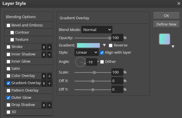 |
| Outer Glow | Blend Mode: Screen, Technique: Softer, Spread: 10px, Range: 50% | Color: #ffffff | 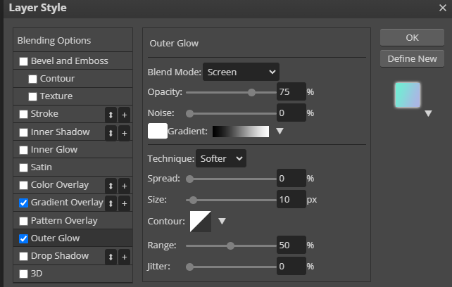 |
Homepage text
| Type | Value | Notes |
|---|---|---|
| Font | 'Inter', ui-sans-serif, system-ui, sans-serif,'Apple Color Emoji', 'Segoe UI Emoji', 'Segoe UI Symbol', 'Noto Color Emoji' | VitePress Default fonts |
| Gradient | From #74ebd5 to #acb6e5 | Direction: Left |
Code block with Tailwind CSS
html
<h2 class="text-7xl sm:text-5xl font-bold mb-4 bg-gradient-to-l from-[#74ebd5] to-[#acb6e5] bg-clip-text text-transparent break-words drop-shadow-xl">screenie</h2>TIP
For really good looking gradients, please refer to uigradients.com, created by _ighosh.